
CLIENT/AGENCY
Mastercard - SapientNitro
MY ROLE
Brand development, Responsive UI design, form design
MONTH/YEAR
May 2016
TEAM
Myself, Art director, Project manager, Offshore development
brief and objectives
- Design the UI for Mastercard’s white label rewards and loyalty program website.
- Showcase to Mastercard's co-branded card partners a fully functioning branded prototype ecommerce website to drive investment in the customisable digital product.
- Mastercard's core business objective of this digital product is to assist and enable their co-branded card partners to give their customers a broader product offering through rewarding spending loyalty.
DESIGN PROCESS AND RATIONALE
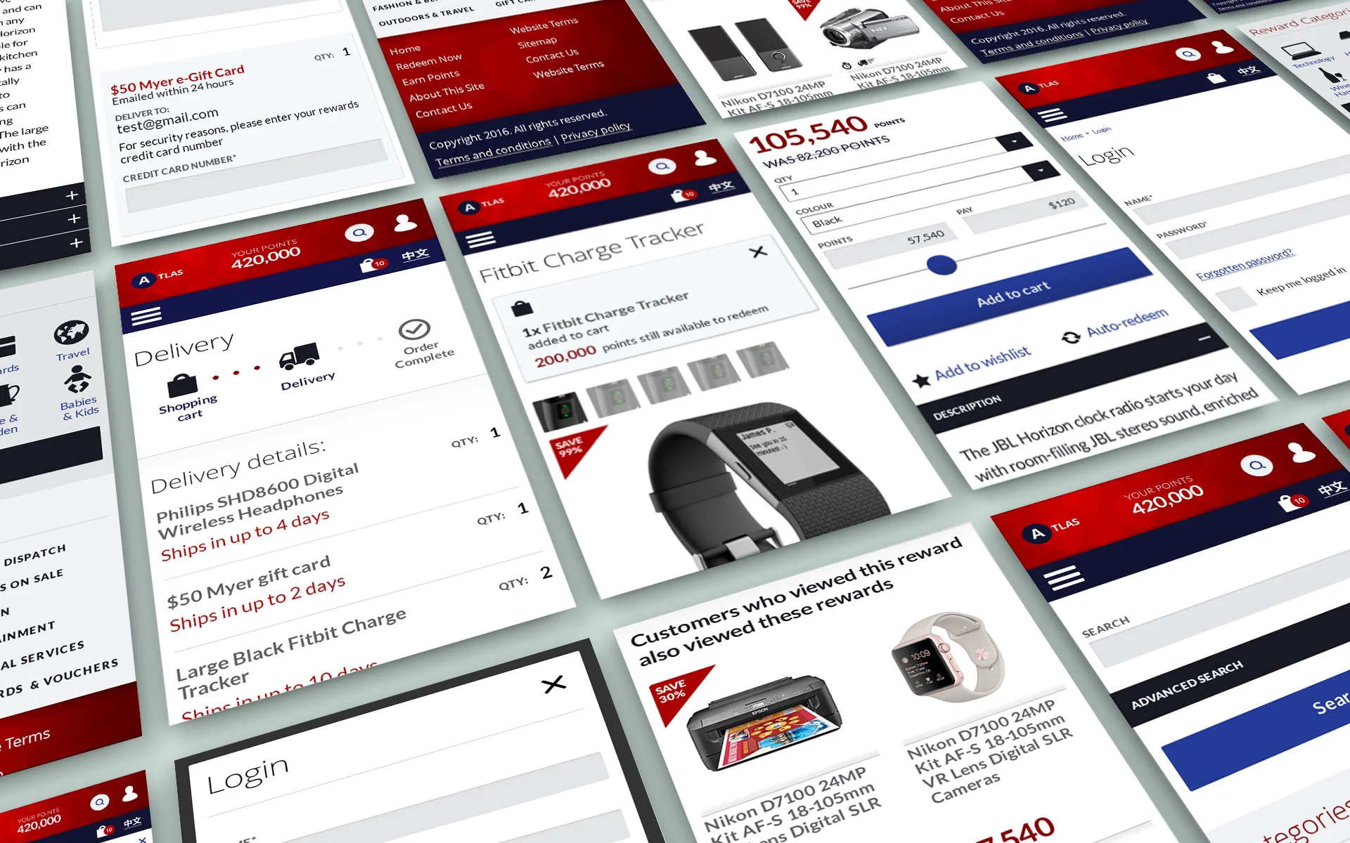
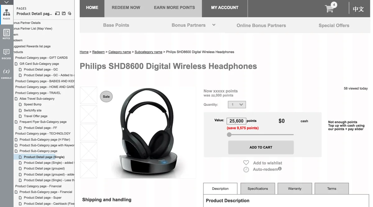
- Work had already begun on this project when I joined the team so we had an Axure wireframe prototype for reference to design from.
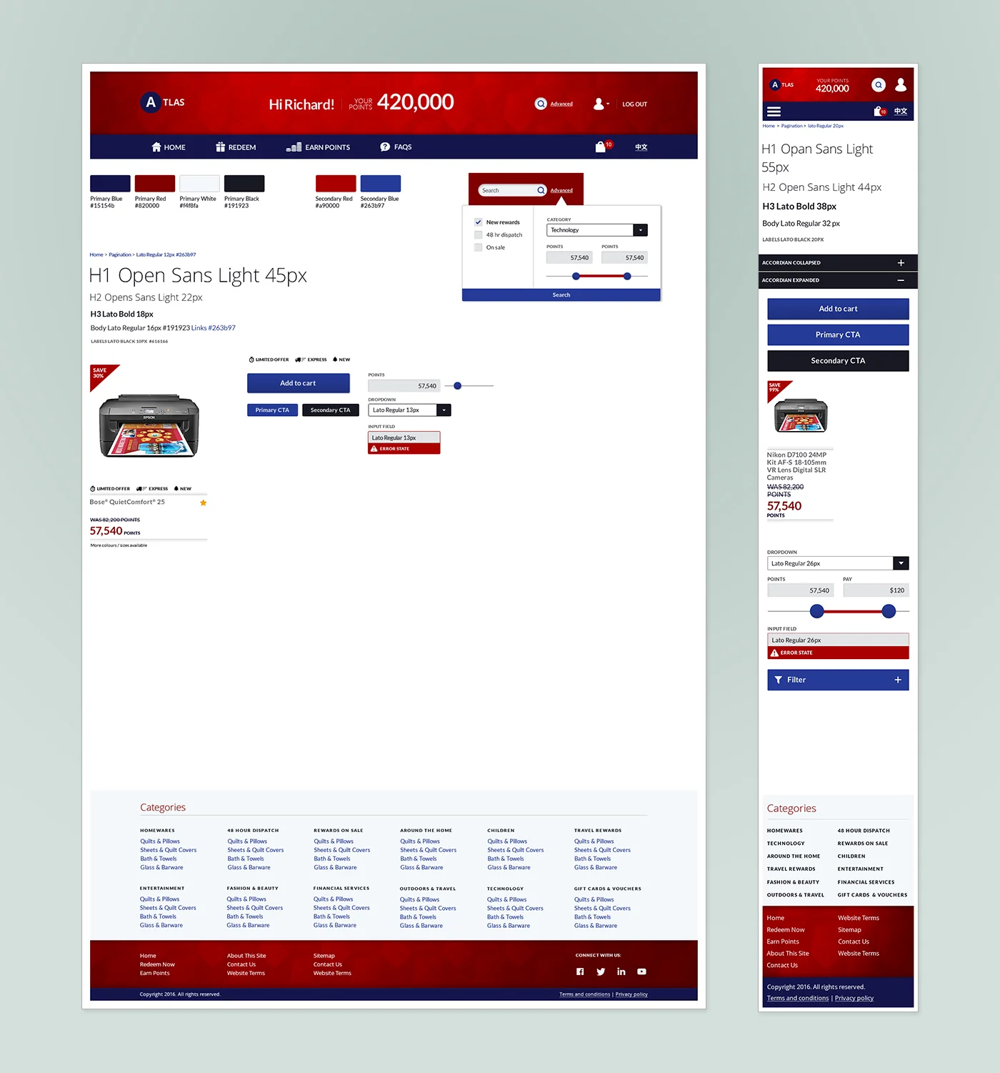
- I worked with the Art director to produce a Style guide and guidelines to be adhered and added to as the project went on so that this white label product would look like as real a brand as possible.
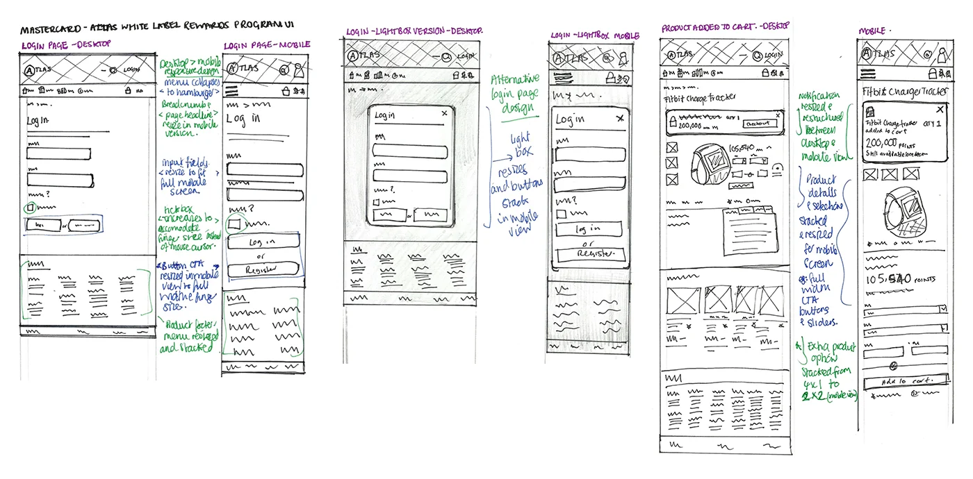
- I produced sketches to help me visualise how I saw the UI elements working responsively and focused on one page at a time.
KEY CONSIDERATIONS and challenges
- Agile management - This was a particularly fast paced environment with a small team of three based in Australia, whilst development was completed in India. As a result of this, the project ran as a series of tight deadline sprints - we had set pages to complete each day, so I would focus on one or two page designs a day for approval by close of play.
- Delivery form and log in page design - In the mobile state, checkboxes were designed to fit finger sizes. As well as this, form input fields and CTA buttons made full width. Options for a light box style log in page as opposed on the main body were explored.
- Product listing design - The product page saw the product description adapt into an accordion layout on the mobile to improve the user experience.
- Notifications - for items that needed to stand out on the interface as an action that had been taken or required such as "Added to cart" or the eCard security form, I created a slight drop shadowed container with a subtle blue background.

OUTCOME AND RESULTS
- Responsive UI designs approved and sent to developers for build.
- I am very proud of the size and scope of this work and working in an agile project management style new to me. Working to tight deadlines challenges you to manage your time and workflow effectively.

