CLIENT/AGENCY
L'Oréal Paris - Numberly
MY ROLE
Email design concepts and creation
month/year
August 2017 to January 2018
tEam
Myself, Marketing exective
multiple projects overview
- Whilst at Numberly, I was the dedicated designer for L’Oréal UK and received the briefs from marketing for all the brands requesting email creative work.
- I would receive a brief from the marketing department and would have 3 hours to develop concepts and produce designs for both desktop and mobile versions to send to the client for review.
- Some would follow a template I had created based off past examples, others would require a custom design.
- Below are my favourite projects for L'Oréal Paris.
Sketches for L'Oréal Paris X Balmain Launch email - custom design
L'Oréal Paris X Balmain Launch email
- Brief: Design an email to promote the L'Oréal Paris X Balmain lipstick range arrival.
- Following on from a waiting list email, the concept behind this design was to create a luxurious look and feel and encourage users to engage with the brand by choosing their lipstick "tribe".
- The client wanted to use their promotional videos in this email so I created a GIF, editing the content to feature all three tribe groups walking as if they were going to meet for a showdown.
- Key considerations for this email were how to create maximum impact on both devices (Mobile and desktop). I designed the lipstick tribe products to be displayed in a carousel to add interactivity.
- This email was one of L'Oréal Paris' best performing emails of Quarter 3.
L'Oréal Paris X Balmain Launch email - custom design (final)
Sketches for L'Oréal Paris Team Xtreme email - custom design style (concepts)
Sketches for L'Oréal Paris Team Xtreme Launch email - custom design (final)
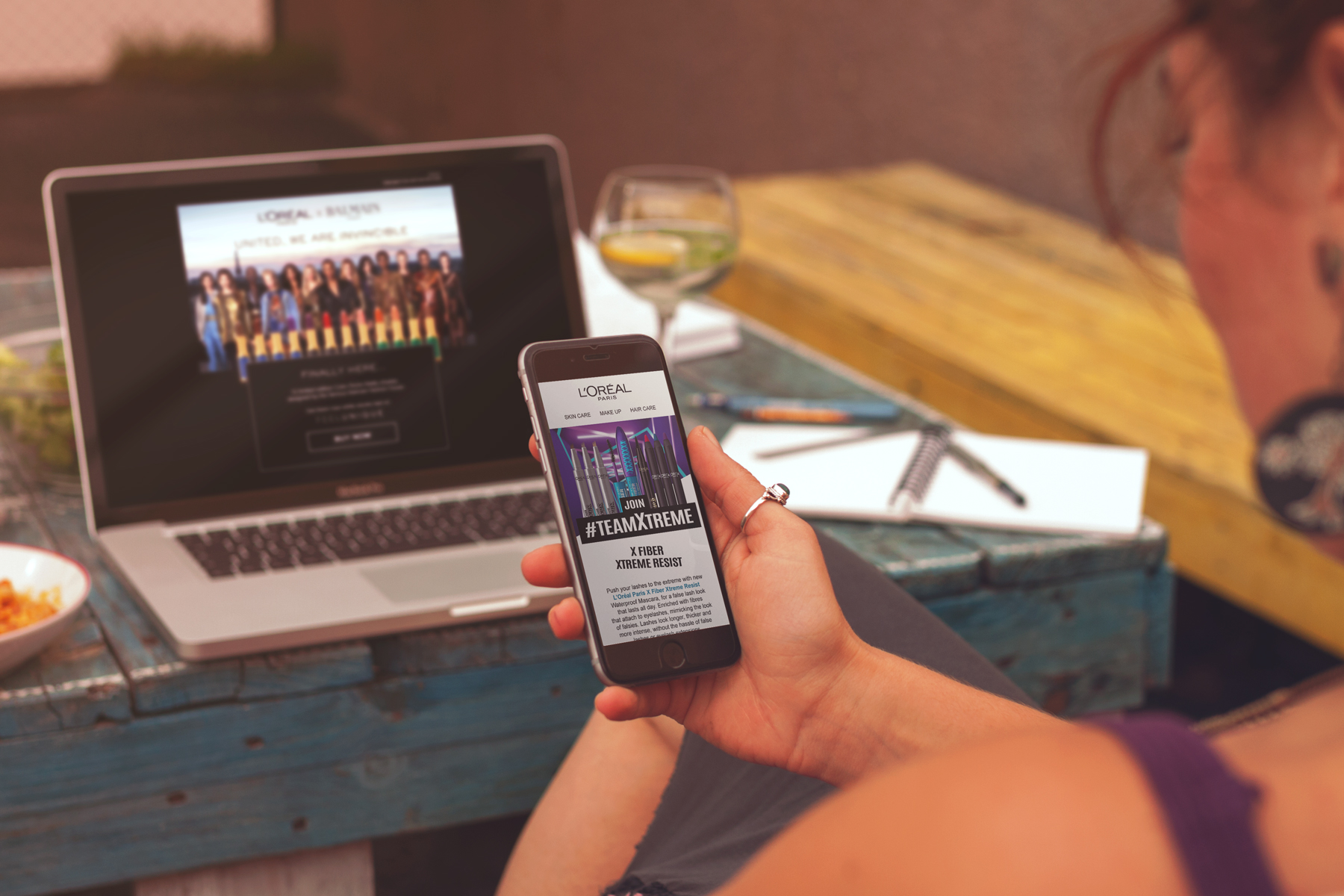
L'Oréal Paris Team Xtreme Launch email
- Brief: Design an email to promote the L'Oréal Paris Team Xtreme range launch.
- For this email I was given free reign with the design, the client did not want to use an existing template and wanted to establish a visual identity for the brand but to incorporate a geometric image provided.
- Firstly I sketched out various concepts for the email design, I wanted to the use the X shape as the premise for the layout and create a product line up at the top of the email to represent a team.
- I decided to use diagonal lines to divide the email into sections using the colours in the mascara packaging to capture the geometric shapes in the supplied image.
- Following the diagonal layout, I positioned the products at angles along the sections and designed the model/eye close up shots as polaroids to add the edgy/striking look.
- One of the key considerations was how to layout 14 different colour lip liners without making the email look overcrowded, I chose a subtle GIF to showcase all the shades, 2 at a time.
L'Oréal Paris Team Xtreme Launch email - custom design (final)
Sketches for L'Oréal Paris Team Xtreme Ecommerce email - custom design
L'Oréal Paris Team Xtreme ecommerce email
- Brief: Design an ecommerce email for the L'Oréal Paris Team Xtreme range, driving customers to purchase products.
- The client wanted this email to have the same look and feel as the launch email ( a big compliment to my previous design) but with more emphasis on sales.
- I used the previous email as a basis and applying the same design rationale, I repositioned the product imagery to reduce the space it took up as the text copy was shorter.
- The key considerations in this design were to highlight the 10% discount and communicate urgency (4 days only).
- I did not want to use roundels in this email as I felt it would not work with the angular look established so far so I designed a blue strip that was positioned at an angle to the product.
- The designs I created for Team Xtreme are the ones I am most proud of from my time at Numberly.
L'Oréal Paris Team Xtreme Ecommerce email - custom design
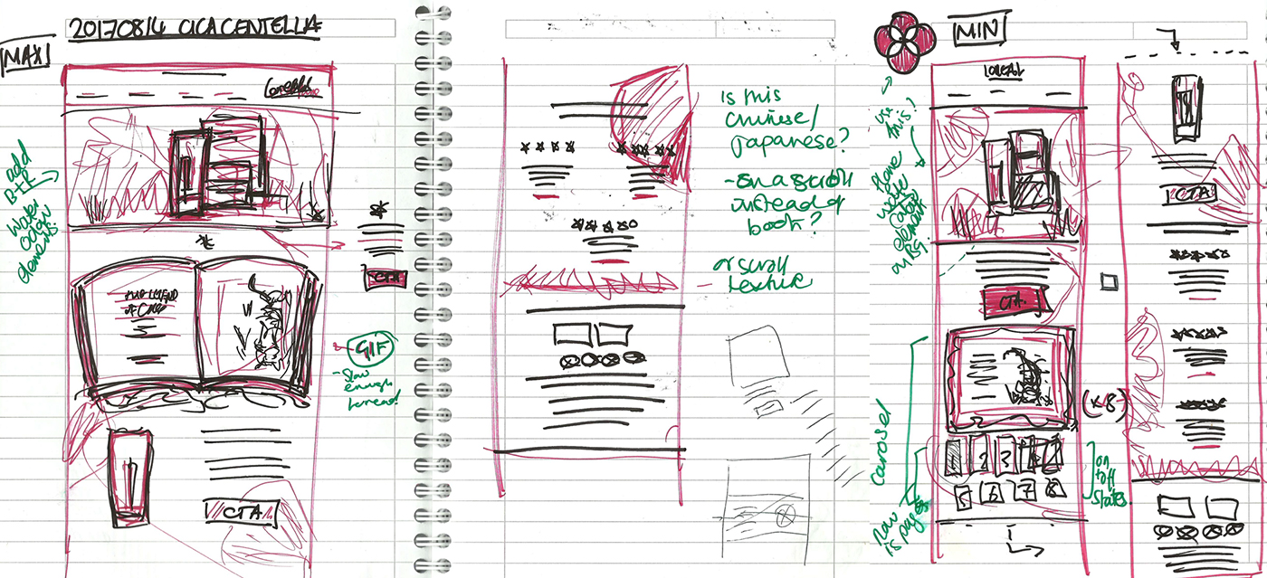
Sketches for L'Oréal Paris Revitalift Centella Repair Cica Cream Launch email - Based on standard template
.Revitalift Centella Repair Cica Cream Launch email
- Brief: Design an email based on L'Oréal Paris' template to promote the Revitalift Centella Repair Cica Cream launch.
- One of the clients key requirements was to include the story of the Cica the Tiger, introducing the background of this product and we were provided with gorgeous watercolour images.
- I sketched out concepts on how this story could be presented within the email, firstly I considered an open story book, but felt a flat parchment sheet would capture better what I felt was an oriental look and feel.
- The biggest challenge was that the story itself was too long for an email so I worked with marketing department to cut down the story down into a suitable length to produce a GIF for the desktop version and a carossel for the mobile version with 6 parts.
L'Oréal Paris Revitalift Centella Repair Cica Cream Launch email final design - Based on standard template
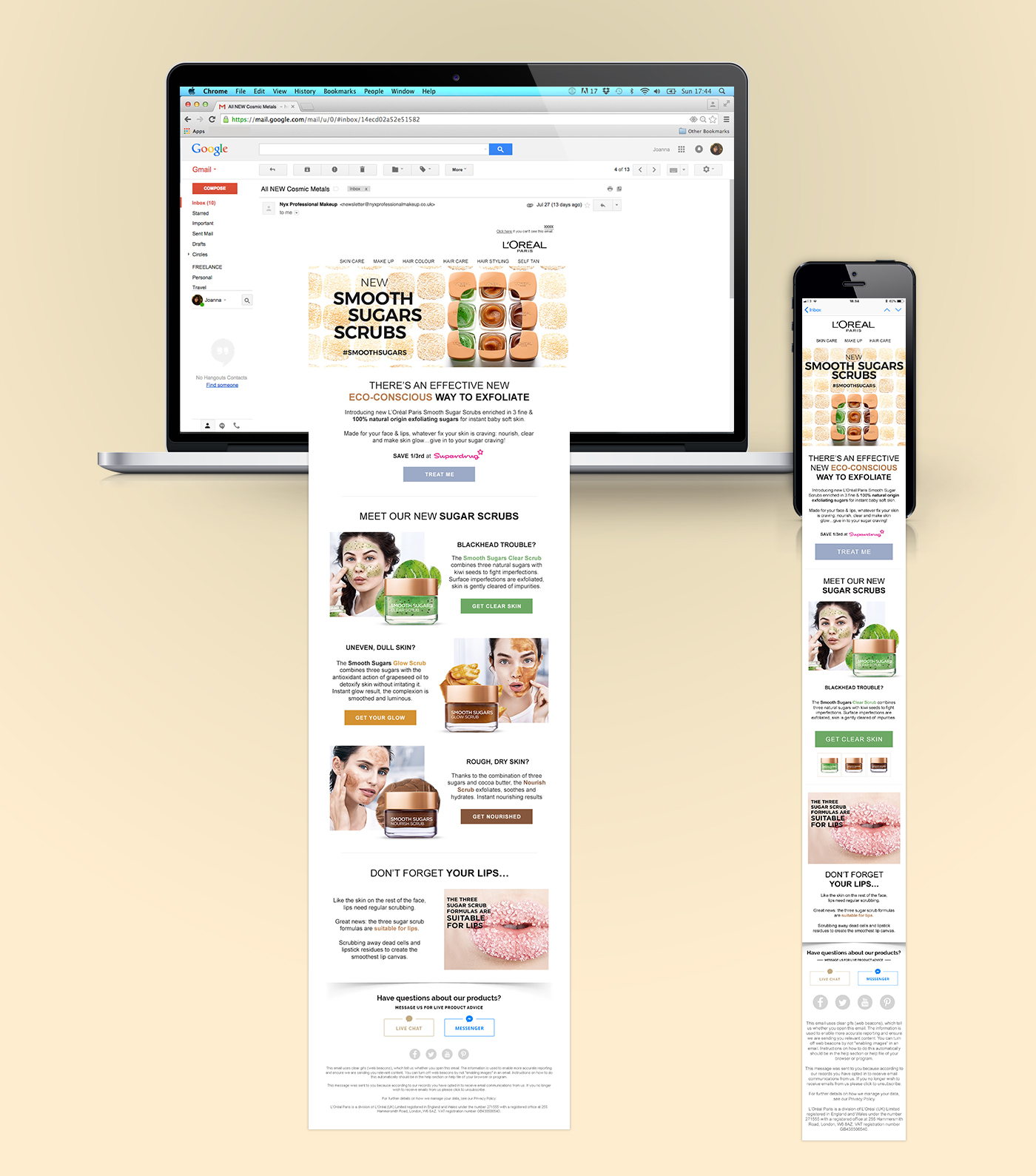
L'Oréal Paris Smooth Sugars Scrubs Launch email design - Based on standard template
L'Oréal Paris Smooth Sugars Scrubs Launch email
- Brief: Design an email based on L'Oréal Paris' template to promote the Smooth Sugars Scrubs launch.
- Normally in a standard template email, all CTAs would be the same colour for consistency, but in this instance I chose colours to represent the three scrubs so they all stood out in their own right.
- One of the key considerations in this design was to aim to reduce the length of the email in the mobile view so that the user would not have to scroll too many times to see all the scrubs available, the solution of this was to use a carousel.
- I am proud of this email, it is clean, simple and effectively captures the brand's look and feel.
L'Oréal Paris Smooth Sugars Scrubs Launch email final design - Based on standard template


