client/agency
Experian
my role
UX/UI design
MONTH/YEAR
April 2019
TEAM
Myself, Optimisation team
brief and objectives
Although best known for being a credit reporting company, Experian is also a credit broker for products such as credit cards, loans, mortgages. It has its own comparison service but not many customers are aware of it
The brief for this project was to highlight the key credit products on each of their dedicated hub pages with the objective to drive more customers through to compare and ultimately apply for one of these product offerings
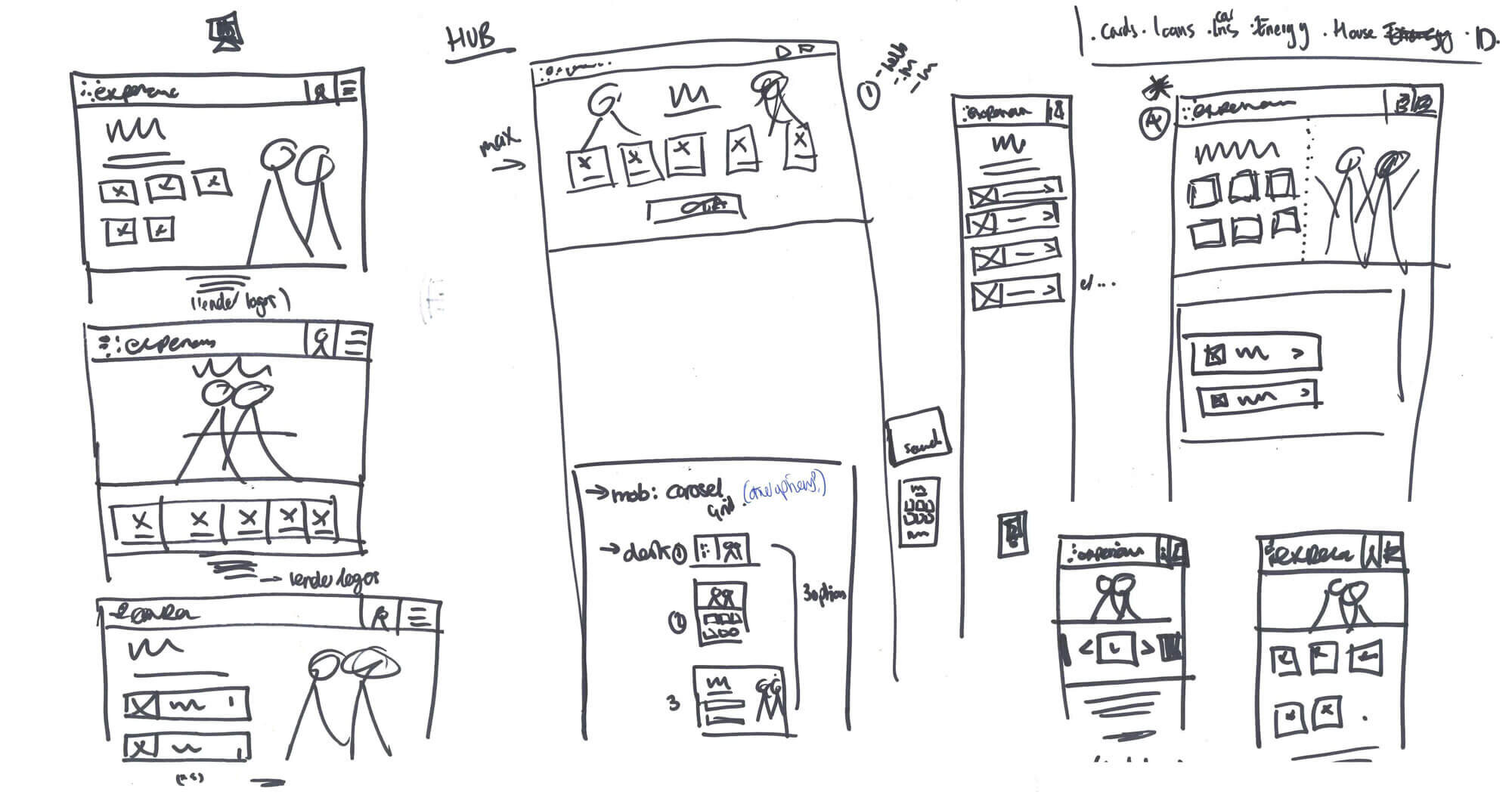
Concept sketches for credit card form entry points
DESIGN PROCESS AND RATIONALE
I started out by sketching concepts for product entry point layouts before creating the UI designs in Sketch
I wanted to ensure that each product entry point was clear it could be clicked on (hover effect was key on desktop) and all featured above the fold
It was a requirement for these pages to feature the “Dataself” marketing campaign imagery
The designs had to take into consideration 3, 4 or 5 options depending on if the hub page was mortgages, loans or credit cards.

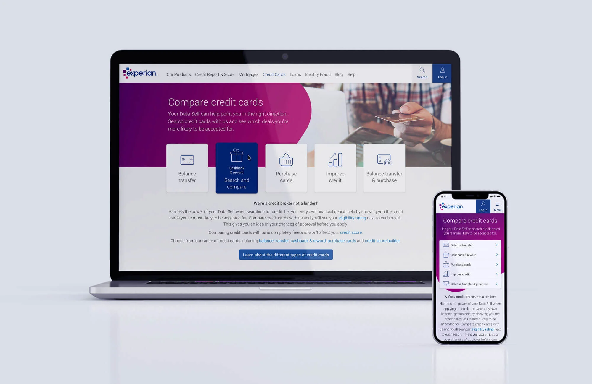
Credit card entry points

Mobile design optimisation
KEY CONSIDERATIONS and challenges
The chosen design was tested with a carousel for mobile. Mobile engagement decreased with this design
To address this, I revisited the mobile design, and given the varying number of products, we decided to use a list view style design with all products visible on the first screen
Further analysis of these hub pages showed that users were not scrolling past the hero image and were not clicking through to the comparison pages in high numbers.
We decided to iterate on these designs to make the hero banner and product entry points work harder
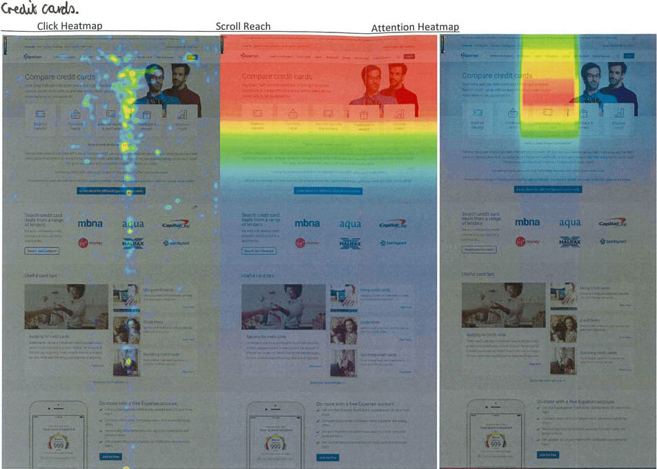
Credit card hub heatmaps
DESIGN ITERATION and TESTING
Working with the Web Optimisation team, we hypothesized that implementing product imagery on-site over the marketing campaign imagery will lead to more customers clicking into the search/comparison form because users will be able to visually link the imagery to the products available
Using product imagery came with its own challenges unlike the marketing campaign imagery that we could superimpose onto branded gradient backgrounds to ensure legibility of copy
To address this issue, I proposed using Experian’s “squircle” shape and gradients from style guidelines as the container for the hero copy giving the page a more modern, eye-catching header.
To further optimise the mobile design, I removed the product imagery from the header bringing the product entry points higher up the page

Using Experian’s squircle shape and gradients from style guidelines
OUTCOME AND RESULTS
The chosen gradient squircle design with product imagery was A/B tested against the Dataself campaign imagery as the control
Clicks into search form increased from 37.07% on the control version to 44.19% using product imagery
Clicks to leads also saw an increase from 6.11% to 8.61% with the product imagery design.
This resulted in an overall uplift click to lead of 40.9%