client/agency
Cellarmasters - Endeavour Drinks Group
my role
Email, social media and website asset, concepts design, delivery and build
MONTH/YEAR
November 2015
TEAM
Myself, Copywriter, Marketing manager
brief and objectives
- Design a digital campaign for Cellarmaster's Black Friday Sale.
- Drive customers to the sale page to use the promo code BLACKFRIDAY with an engaging email, Facebook post and website banners.
- The core business objective of this campaign is to drive interest and exposure of Cellarmasters to new customers and existing ones looking for a bargain.
DESIGN PROCESS AND RATIONALE
- Following a briefing with the marketing manager, I worked closely with a copywriter to produce the full digital campaign - emails, social media and web assets including banners for the homepage, landing page banners and affiliate sites.
- I wanted to produce an eye-catching design that would spark the viewer's interest and intrigue, encouraging them to click through to the website and get shopping, despite the limited branding assets to work with.
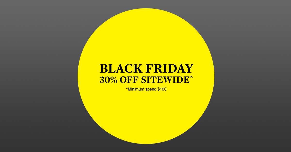
- My thinking behind this design was to use the darkest grey gradient from the guidelines to represent Black Friday, and the white punchy headline to create a sense of urgency.
- I used the yellow circle as a way to differentiate two parts of the email message, highlighting the promo code and driving recipients to the call to action button - the brightness on a dark day!
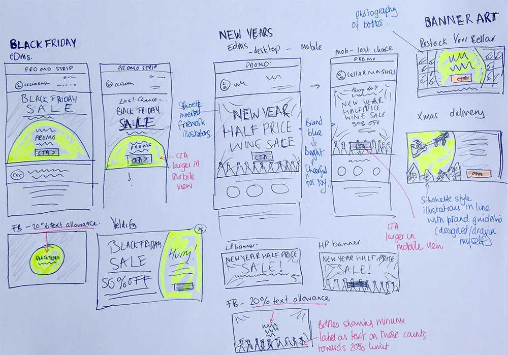
- I presented this concept to the marketing manager with sketches, wireframes and visuals for the email. Once approved this was rolled out to the other digital assets.
KEY CONSIDERATIONS and challenges
- The main email banner was designed so that it could be used in both the desktop and mobile version.
- With limited brand assets to work with (yellow circle, serif font and grey gradients), I wanted to create an email that was engaging to acheive a high click through rate to the website's sale page.
- Some of the digital assets presented their own challenges such as 20% text limit rule on Facebook posts which includes bottle labels.
OUTCOME AND RESULTS
- The Black Friday Sale campaign performed exceptionally well with an open rate of 21% and click through rate of 14%
- The full 4 day revenue forecast was reached within the first 4 hours of the email being sent.
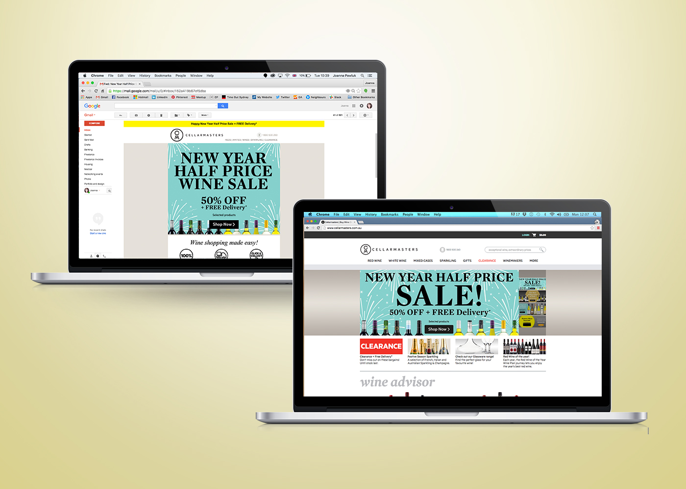
- Due to the success of the look and feel of my design concept, I rolled it out on other digital campaigns including Christmas Delivery and New Years sale.


