CLIENT/AGENCY
Ikea - Tribal DDB
MY ROLE
UX Wireframes, UI, Responsive design
month/year
August 2015
team
Myself, Digital producer
brief and objectives
- Develop a responsive landing page to promote Ikea's hidden catalogue competition in Canberra.
- Introduce new prospect and existing customers to the products Ikea sells and raise awareness of the new store in Canberra opening soon.
- The core business objective of the new store is to drive interest to potential customers in a location, increasing their target market area and competitiveness.
DESIGN PROCESS AND RATIONALE
- The design had to use the Ikea branding, website header, footer and navigation, so with that in mind, a scrolling page worked best for the UI structure within the main website.
- Using Ikea's brand guideline for a clean and simple design, I drew up sketches for the desktop UI concepts, adapted to display best on mobile and produced wireframes.
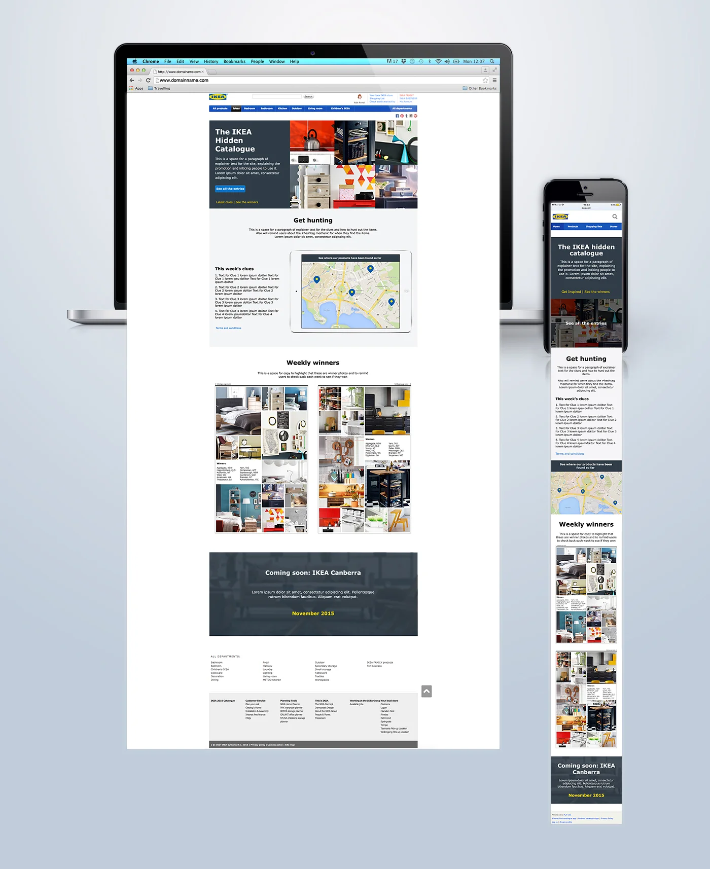
- The design consisted of four different sections splitting up the content into four key points - What the competition was and what they had to do, the clues, the winners and the new store coming soon.
KEY CONSIDERATIONS and challenges
- It was particularly important that this landing page was responsive as users would most likely visit the website when out and about searching for the hidden pieces of furniture and upload their entries.
- Responsive design to allow best viewing experience on the mobile included the stacking of sections, text size and the interactive map of the item locations expanding to full width and the tablet device showcasing it in the desktop view would be removed.
- Structuring a design for spaces for 24 winners in a layout that paid homage to an Ikea style paper catalogue worked well in the desktop view but on mobile was hard to view. I advised having the pages stack and split by weekly winners so the images were still big enough to see on a mobile screen.
OUTCOME AND RESULTS
- Responsive UI approved by digital producer and sent to client for sign off.
- Although the hidden catalogue competition has now ended, the landing page is still live and features the winning entries - Check it out here.


